
Author: JT
-

Fitness Company This Is Gold!
How cool is this? I just love this branding that they have done.

Well done Fitness Company.
-

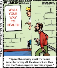
Caption Contest: What’s With A Bag On A Treadmill
The person who comes up with the best use for the bag on the treadmill will win an Amanda Gore Joy Pack!

On my recent trip to India, the hotel gym’s treadmills had a small bag hanging on them. I have never seen such a thing before, which got me thinking, “What is doing with the bag? What is it for?”
I still have no idea what they are for. And you can help me with an inventive use for them.
In the comments section below tell us your inventive use for the bag and you could win the Joy Pack from Amanda Gore.

Your Joy Pack includes:
- Joy Wand;
- Gratitude glasses;
- The Gospel of Joy book;
- Joy with Amanda Gore DVD;
- 5 endorphins
For more on the Joy Fairy herself, Amanda Gore check out http://www.amandagore.com
To enter is simple . . .
In the comments section below, include your caption for the photo and on the 1st October we’ll announce the winner! Have fun and let your imagination go wild!!!
-

7 Design Mistakes That Make Readers Trash Your Emails – Part 3
Number 3 of the seven common design mistakes that get emails trashed today:

Colour catastrophes
For your email to look professional and inviting, you have to master colour. The biggest colour mistakes are:
- Garish colour. Stay away from colours that are overly bright or florescent. Tone them down so they don’t compete with your words.
- Too many colours. Use a colour palette with two dominant colours and tone down the rest to make your emails look cohesive.
- Light text on a dark ground. The most readable combination is dark text on a light ground, so stick to that whenever possible.
Source: Constant Contact – http://conta.cc/XCFD8P
-
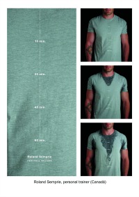
Love it Roland Semprie!
Two words to describe this marketing: “Bloody Ripper!”
I seriously like this marketing piece and think it matches the personal training niche perfectly! Well done Roland.
Or do you disagree?

-

The Secret To Business Success Is Simple
The best performers at business, do not hide behind a desk.

They know that business is all about connecting with people. When people know you, like you, trust you they will help you and do business with you.
-

Business tips for Personal Trainers: Surveys
Kate Tribe from Tribe Research shared some great ‘survey writing’ tips with us on a previous webinar, here are just a few highlights from the webinar she presented:

- Develop a database to provide you with information that you can continuously add to.
- Ask questions regularly and remember – there is no point doing feedback if you don’t act on it.
- Regardless if you have a big or small database, it’s still relevant to conduct a survey to gain information and feedback.
- Be clear about your survey and consider the following points, who is conducting the research, what’s your objective, what are you doing with the results, who will see the responses.
- When asking someone to participate in a survey, always make sure you thank people for their time!
- Here are some questions she believes we should be asking regularly:
- When you think of my business, what are the first three words that come to mind?
- How likely is it that you would recommend out company to a friend or colleague?
- What one key thing could we do to improve your experience?
- What is our key strength?
-
7 Design Mistakes That Make Readers Trash Your Emails – Part 2
Here’s how we all sort through our inboxes:
- We choose an email message
- We give it a two-second glance
- We decide if it’s worth our time
- If it is, we keep it and read it
- If it’s not, we hit the delete key, and send the email to the trash
How can you keep your email out of the trash? The secret is good design. In those first two seconds, that’s all your reader sees.
Number 2 of the seven common design mistakes that get emails trashed today:
Hard-to-read fonts
Your email newsletter’s main goal is to communicate, and – obviously – that happens through words. But what if the words are hard to read?
Be sure to avoid these two errors:
- Using fonts that are too small. This is especially important if some of your readers are 50 and over, and may have eyesight problems. And with so many emails being viewed on smart phones, it makes sense to increase font sizes.
- Using too many fonts. Combining too many different fonts makes your email look messy. Pare it down to no more than two fonts, and just use the italic and bold weights to add variety.
Find out more about how to use fonts by clicking here.
Source: Constant Contact – http://conta.cc/XCFD8P